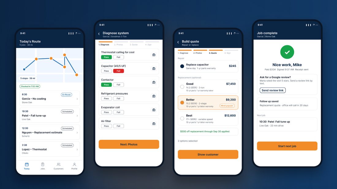
One phone, from arrival to signed job.
One service call lives in five different places.
At Air to Air AC & Heating, the company I co-own, a single call is spread across paper tickets, texts from the office, photos lost in a camera roll, quotes worked out in the tech's head, and financing explained out loud. Jobs run long, homeowners feel pressured, and replacement opportunities slip away.
How might we help HVAC technicians close out a service call faster, while giving homeowners quotes they can actually trust?
What I learned in the truck and on the phone.
I combined my own experience running dispatch and customer calls since 2023 with conversations with our field technicians, a review of our job tickets and Google reviews, and a competitive look at ServiceTitan, Housecall Pro and Jobber.
Personas
“I want the paperwork done before I leave the driveway, not at 9 at night.”Needs to finish each call fast, show proof instead of just his word, and never redo lost work.
“Just show me what is wrong and what it costs. No surprises.”Needs plain language findings, repair vs. replace on her own terms, and her monthly cost before she commits.
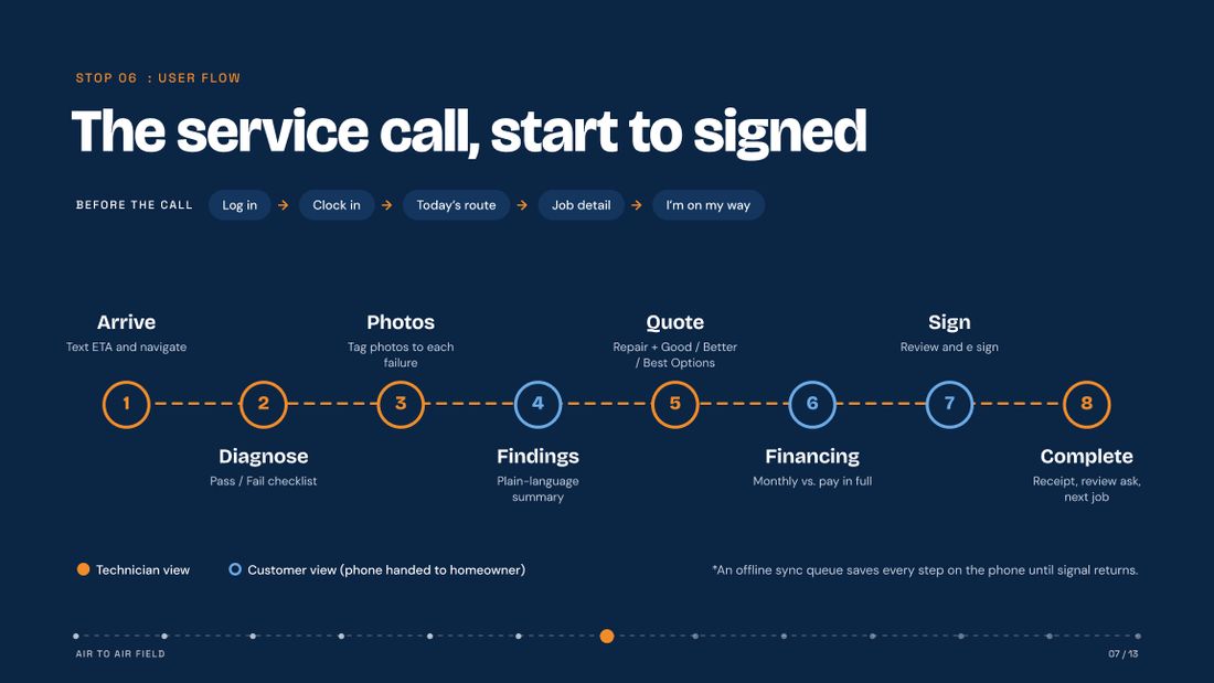
Eight guided steps, with clear hand-offs.
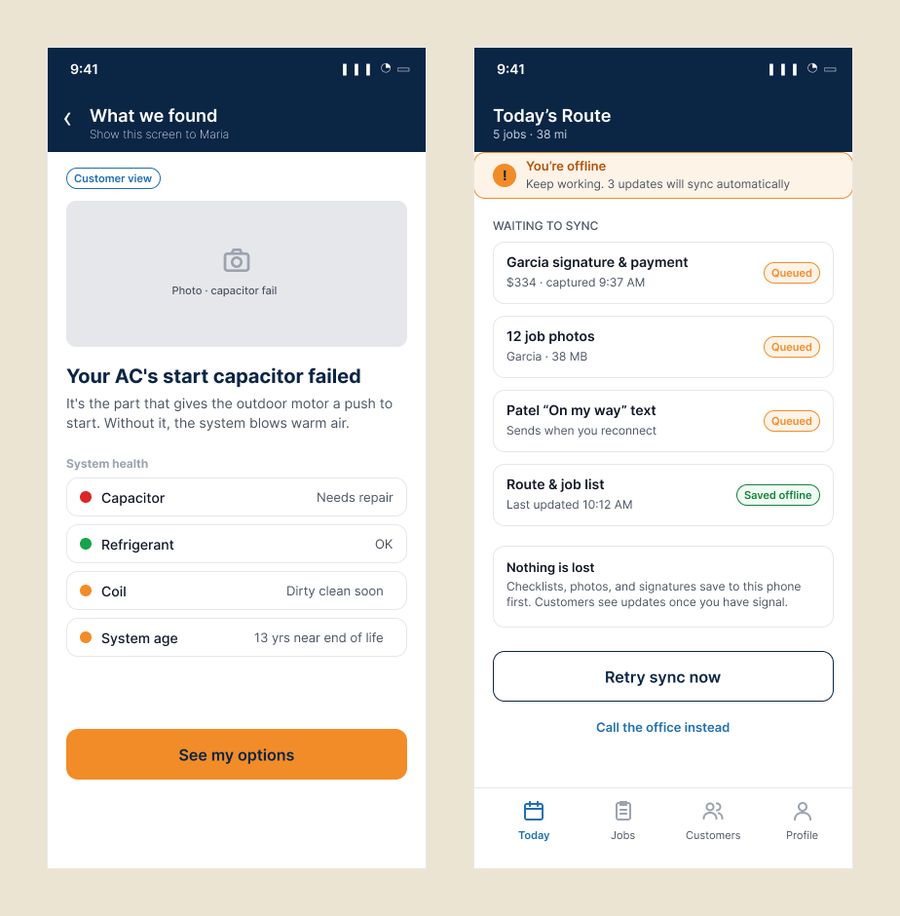
Eight guided steps take the tech from arrival to signature. At three of them the phone is handed to the homeowner, so those screens switch into a clearly marked customer view.
Process
- Discover & defineSprints 1–3: research, personas, problem statement, information architecture
- Wireframes & testingSprint 4: 20 low fidelity screens across 7 sections, then usability testing
- Style guide & flowsWeek 5: color, type and components; the end to end service call flow
- Clickable prototypeFinal: 20 connected high fidelity screens in Figma
Style guide
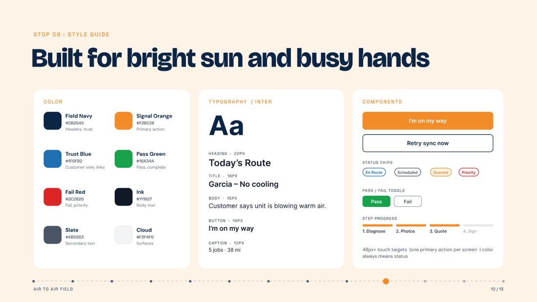
Built for bright sun and busy hands: high contrast navy and orange, 48px+ touch targets, one primary action per screen, and color that always means status.
Tested in the field, with the people who'll use it.
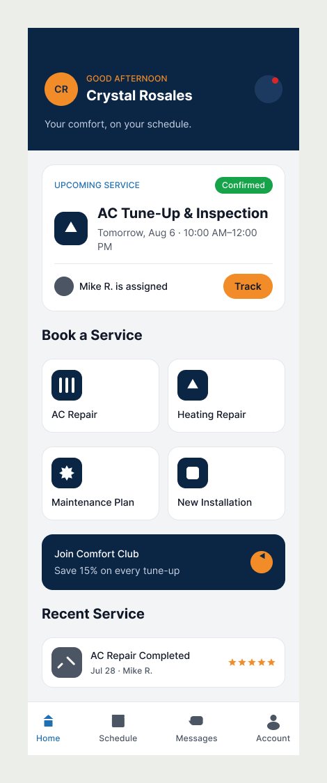
Air to Air GO, the homeowner side.
Field covers the technician. Before it, I sketched GO, a booking and tracking concept for Air to Air customers that answers the question behind most calls to our office: is someone coming, and when?
I restyled it with Field's design system (navy, signal orange, Inter type and bordered cards), so the two apps read as one service from the homeowner's first booking to the tech's signed job.
What I'd do next.
Designing for my own team meant every assumption got checked in the truck, not in a meeting.
The biggest lesson from testing: the moment the phone changes hands matters as much as any single screen. Next, I want to test on live service calls, measure time from arrival to signed job before and after, and connect scheduling, payments and financing.